Data Visualization Techniques

Information analysis is a big part of day-to-day work, because reading, writing and understanding large documents takes time. That is why it is better to reduce the textual component and add visuals to reports. Data visualization techniques are used to simplify complex or boring information and turn it into a graphical format that is easier understand. This article dives into the techniques, types, examples and trends in data visualization.
How Does Data Visualization Work?
The human brain perceives information better in graphical formats. Data visualization techniques allow for complex information to be presented more appealingly and in a format that is easier to understand. Exploring tables, scales, charts, etc. allows for information to be processed quicker than when reading lengthy reports. Data visualization is commonly used in business as well as in the average individual’s life. Some sources provide tips on color usage, because contrasting colors can be used to highlight information. Multiples of the same color may not make it easier to process data.
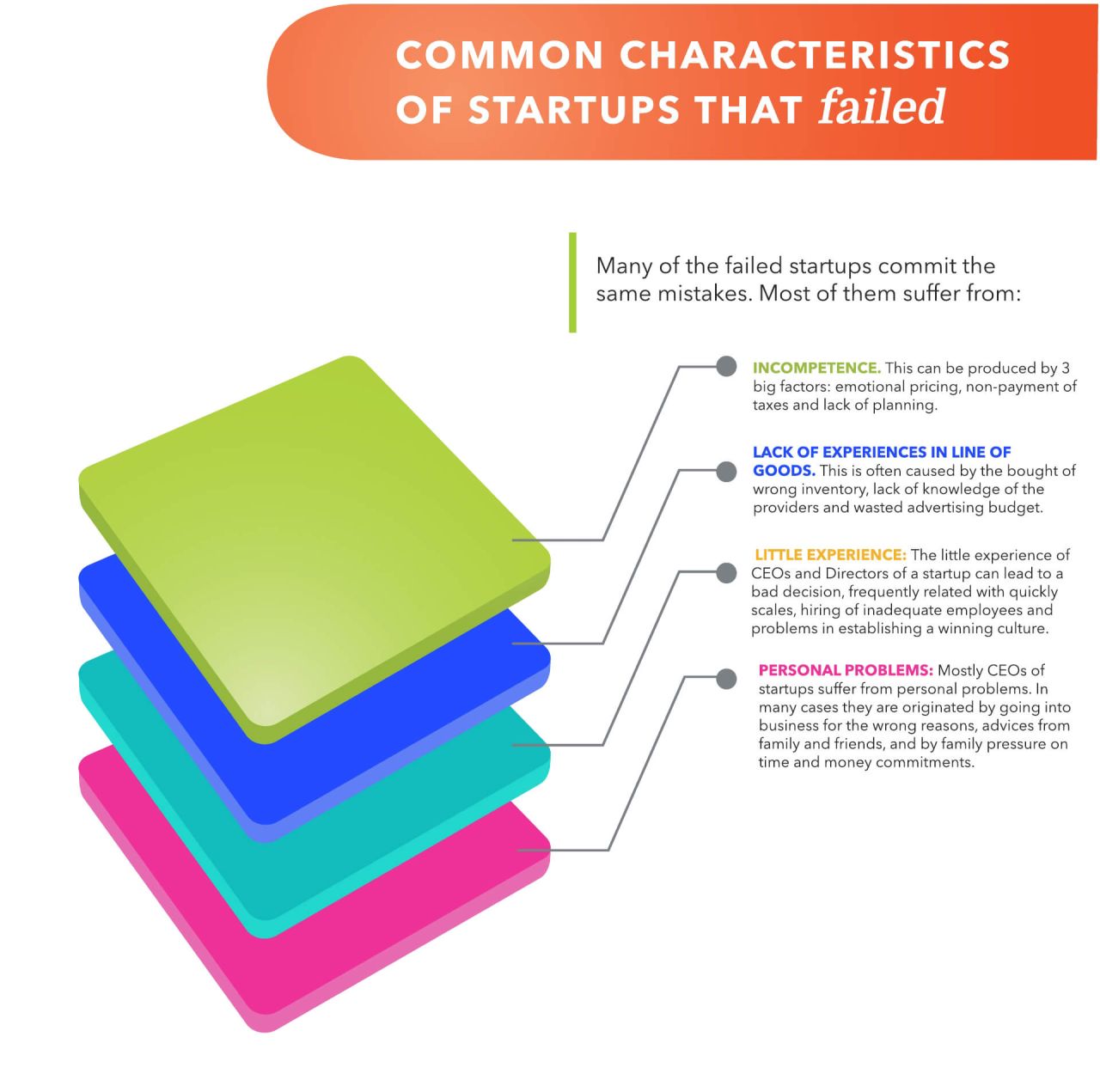
For example, a wealth of information can be presented compactly
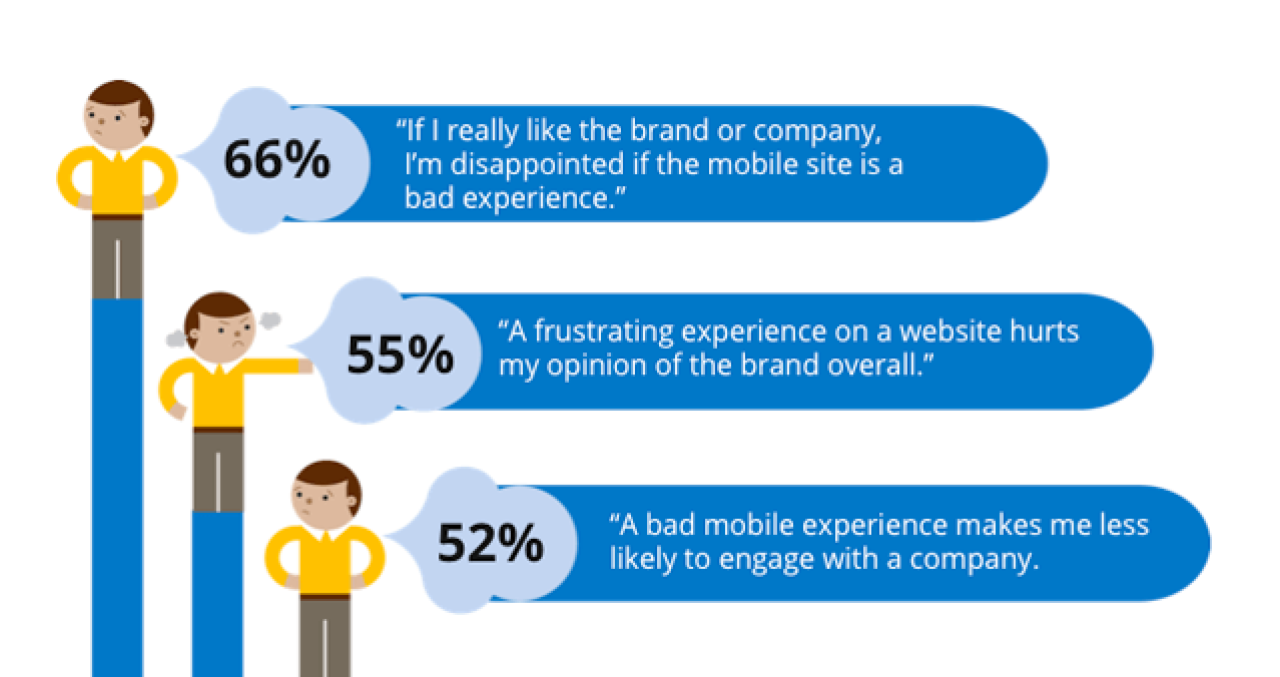
Customer mobile experience
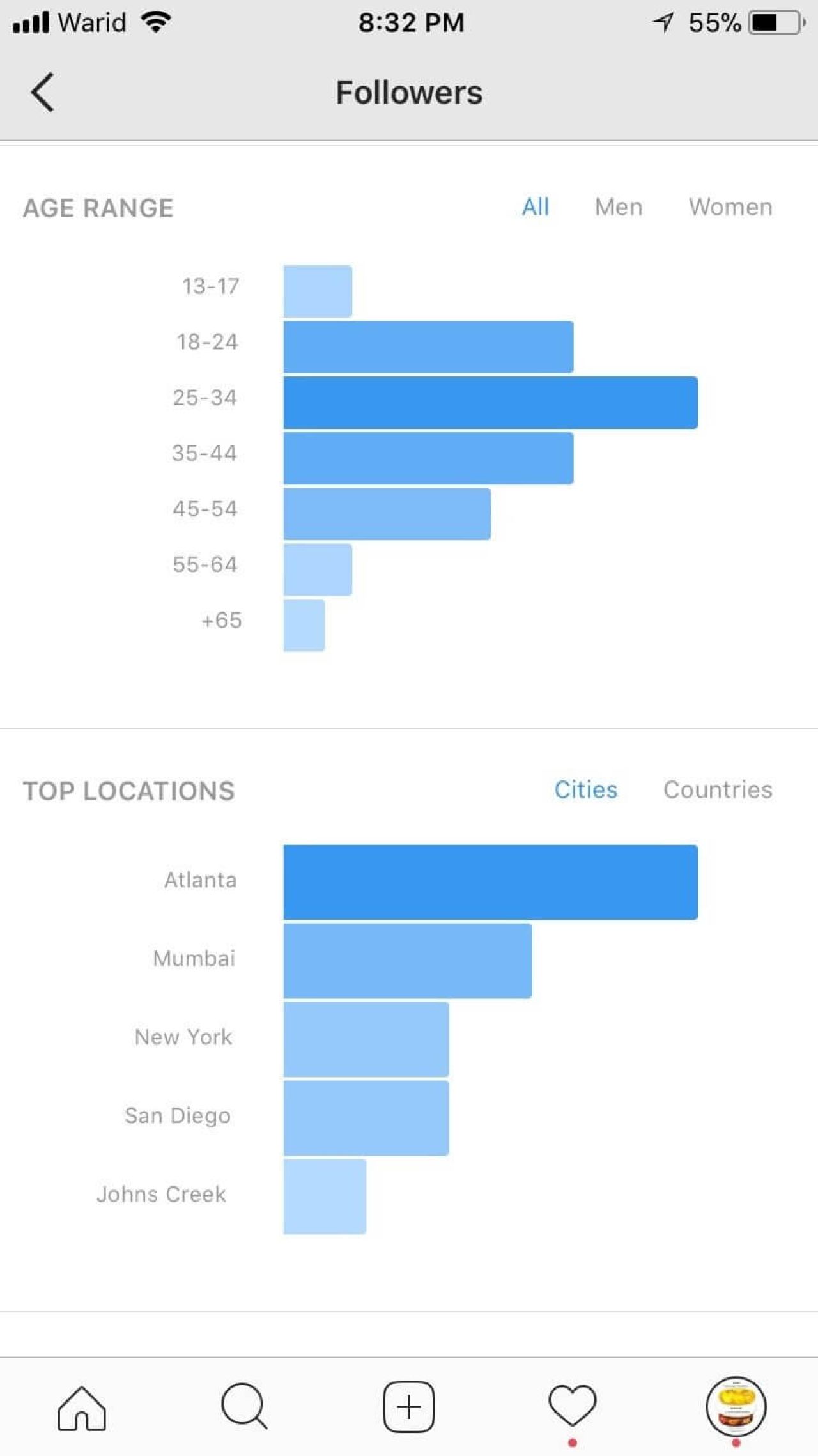
Personalized social media statistics
Personalized social media statistics
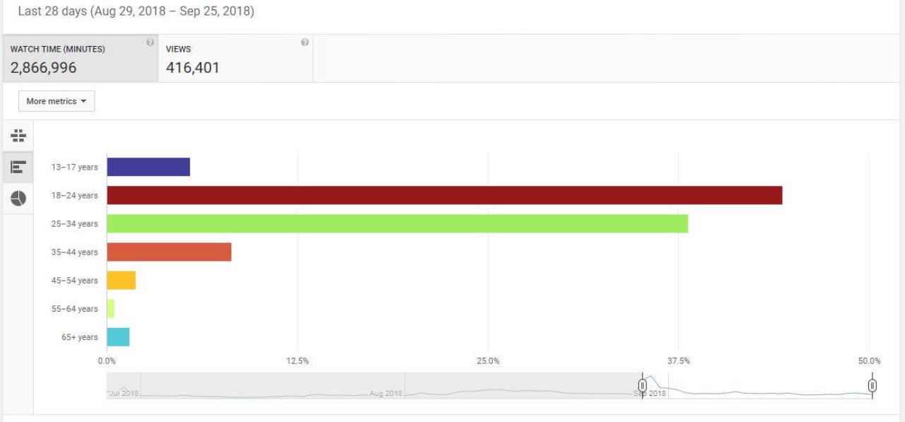
Data analytics can also provide the following information:
- The demand curve shifting
- Customer satisfaction and feedback
- Customer preferences analysis
- Social media reports
- Follow-up reports
- Which areas of business should be improved
Data Visualization Techniques
As data visualization usage spreads, designers require enhanced knowledge and will need to create an expanded range of visualization types. Examples of data visualization types are given below:
Area or Scatter Maps
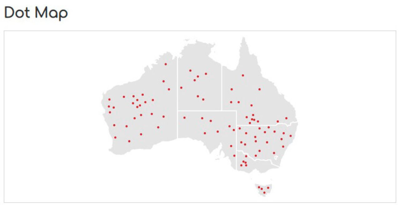
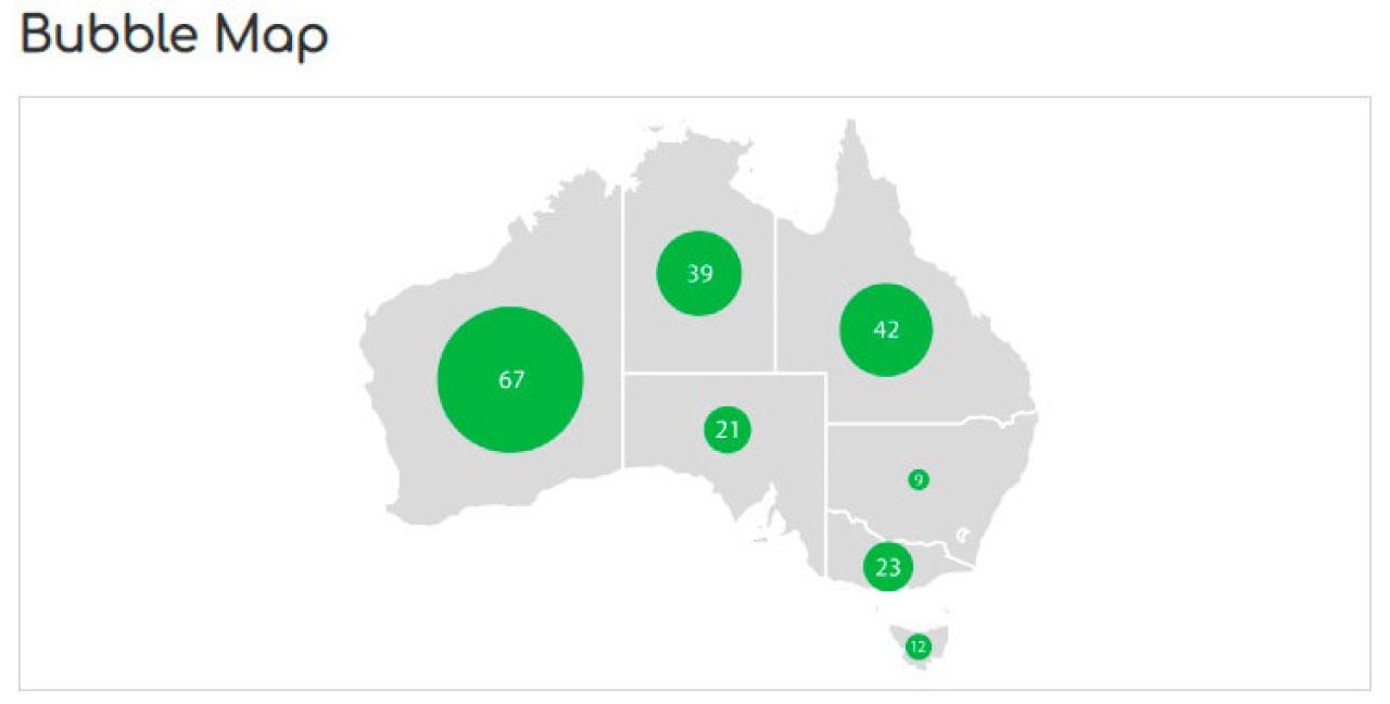
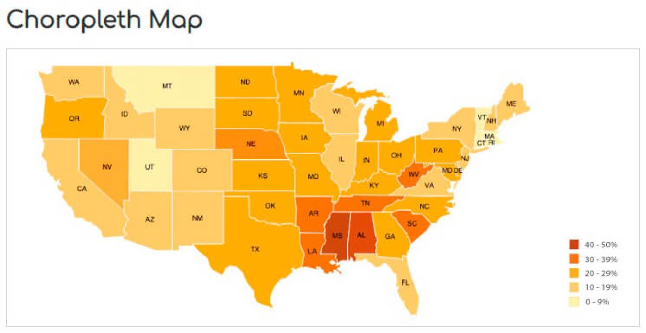
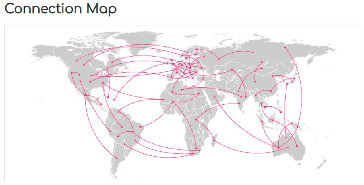
Maps can be represented via dot, bubble, choropleth or connection techniques depending on different requirements. Area maps provide an analysis of a geographical region in contrast with other regions.
Dot Map can be one of two types: one-to-one (when 1 dot = 1 object) and one-to-many (one dot represents a unity of objects; e.g. 1 dot = 100 people).
Bubble Map displays circles over geographical areas proportionally to its value in a dataset. A bubble map excludes issues caused by the size of the area, but large bubbles can overlap smaller ones.
Choropleth Map shows divided geographical areas in different colors, shades or patterns according to data.
Connection Map shows relations and routes between geographical regions.
Charts
Bar, donut and pie are the most common chart types used to display quantitative data. More information about different charts is given here.
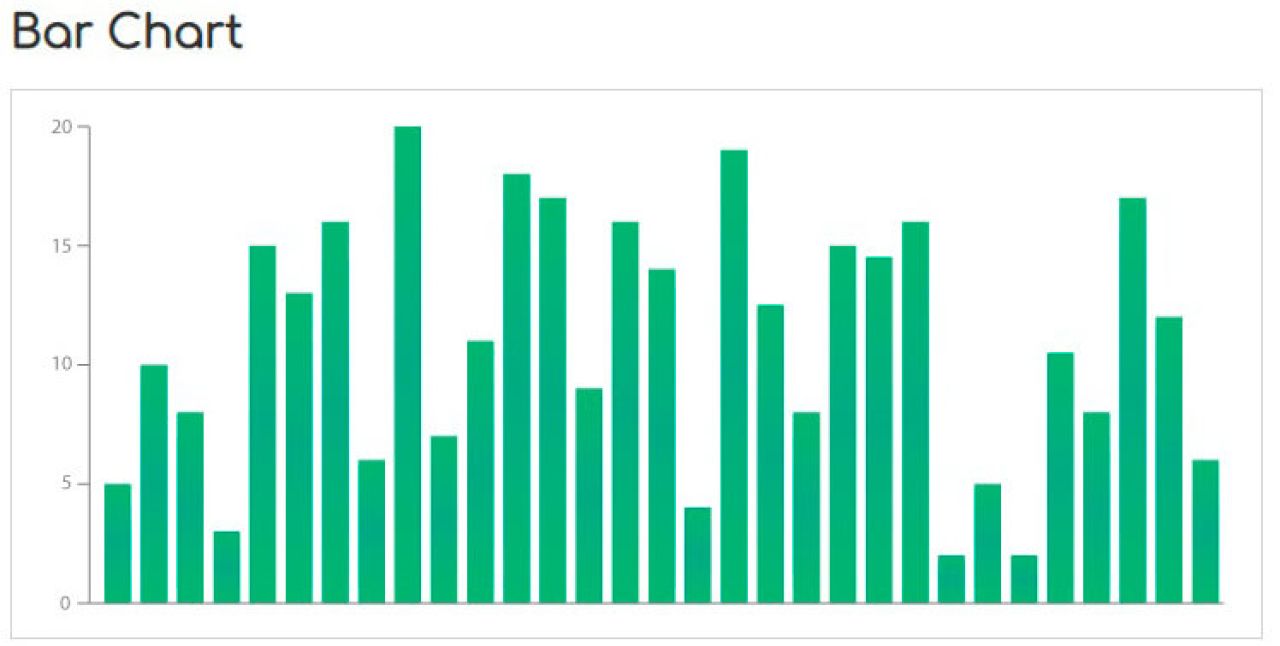
Bar Charts consist of vertical or horizontal bars, which show numerical comparisons. Bar charts display only quantitative values and are unable to track changes in time.
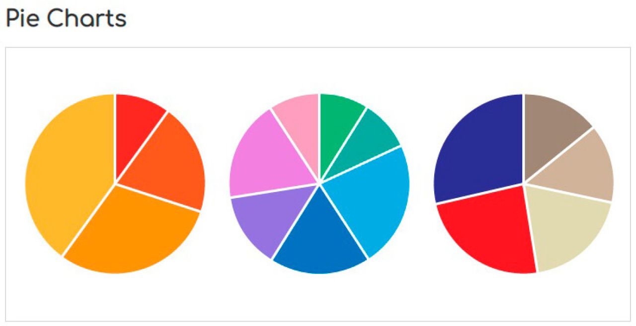
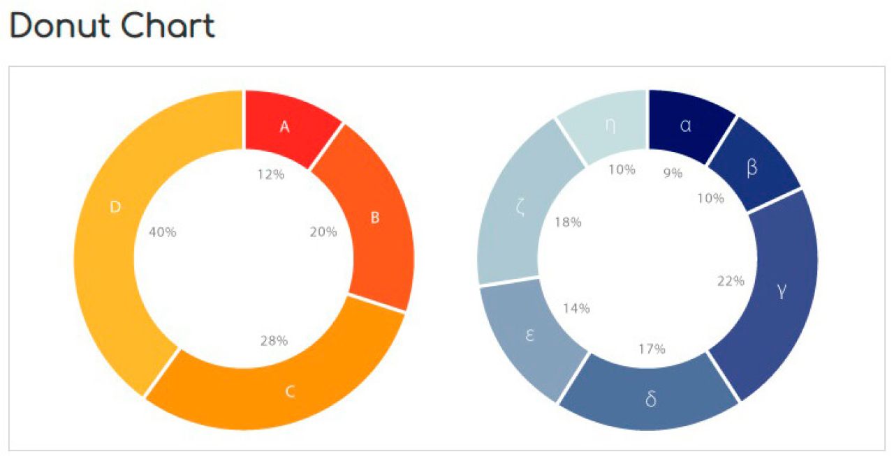
Pie and Donut Charts are circles divided proportionally to the numerical values of the sectors. These charts show percentage relations to the total value.
Interactive Data Visualization
Interactive data visualization shows only requested data and hides other information when not required. Interactivity allows the request to vary or for more data to be explored. Examples of interactive data visualization are given below:

This is a real-time global map of wind, weather and ocean conditions. The globe can be zoomed in on and rotated so that it will show a particular zone, while all the other areas are hidden. It displays complex information all over the world and at the particular chosen point.

A Real-Time Lightning Map is another example of interactive data visualization. Users can zoom in on a particular country, area or even a street to see more details or to observe the information internationally.
There are also different interactive visualization techniques, pyramids, diagrams, graphs, etc. exist. The wide choice allows to find the best option for specific requirements.
Data Visualization Trends
Color Trends
There are two aspects relating to colors: diverging and qualitative data. Diverging data indicates information that progresses from low to high, implying gradient usage. Qualitative data uses different featuring colors.
Data Storytelling
Data storytelling includes the setting, the time span, and good narration to present complex information. Storytelling not only provides the audience with the key facts but it evokes emotions as well as gaining attention.
Virtual and Mixed Reality
Currently, houses can be designed, theatrical performances can be watched, 3D artwork can be created, games can be played, and interactions can be made all via virtual reality (VR). VR data visualization is also available. A person wearing a VR headset can interact with the data in a virtual space.
Visualization capacities will develop as new techniques appear. On top of the different types of visualization that exist, there are also choices in software, tools and color palettes.
Data Visualization Software
The benefit of data visualization is in the reduced time required to perceive information effectively, especially when it is entrusted to reliable software. The usability objective of the software is that all the information is processed automatically and can be visualized in two clicks. Forbes named “The 7 Best Tools For 2018,” which are given below for convenience:
Power BI gathers real-time information through Excel, Google Analytics, SalesForce or Social Networks and turns it into visual reports that contribute to an organization. Power Bi also has an application for any device, which allows for changes to be made on-the-go.
Tableau software suggests analytics for individuals, teams and organizations. It also has an embedded analytics solution for other applications or products.
QlikView defines itself as the only open-ended platform on the market. The software is easy-to-use and is self-service focused.
Sisense is an end-to-end software, which aims to make data easy to understand and uses interactive visual techniques.
Fusion Charts can be displayed identically on any device, due to the native JavaScript basis. Its support service helps to code and modify charts instantly and sometimes helps for free if an individual got stuck in coding.
Plot.ly is an open source with rapidly growing visualization libraries for R, Python and JavaScript.
Carto is an open source software which specializes only in maps and suggests vector mapping and cartography for data visualization. Its service is affordable for both small and large companies, as the price depends on the customer’s needs and requirements.
American Management Association concluded that visualization makes information 70% more memorable. Data visualization saves time when analyzing statistics, especially with relevant software. It can also highlight the strengths and weaknesses of a business.
Why is VironIT Reliable For You?
VironIT, a software development company, has been gaining experience since 2004 and has implemented more than 500 projects for different companies, including Turkcell, AnatomyNext and CephX. If you have a data visualization project in your mind, please feel free to contact us.

 (27 votes, average: 4.85 out of 5)
Stay tuned. Monthly digest of the best stories.